CEDARS-SINAI
ESTABLISHING A MOOD & STYLE FOR DIGITAL
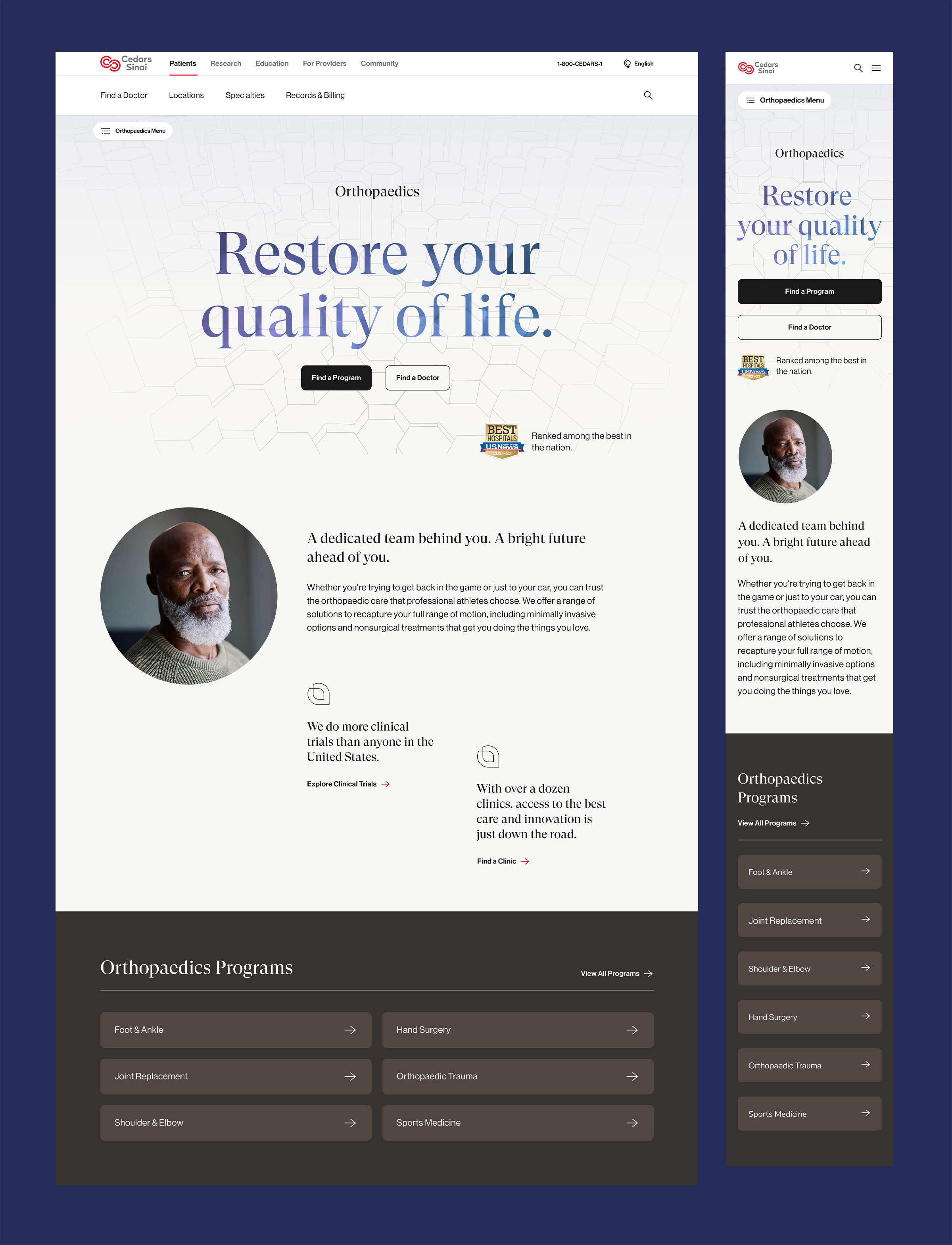
After years of struggling with an outdated and organization-driven digital experience, Cedars-Sinai wanted fast, iterative, and most importantly consumer-driven change. And, with it's biggest challenge of being known as the premier destination for complicated, life-saving and life-transforming care causes a perception of inaccessibility and creates an inapproachable distance between the hospital and the vast geographic area they aspire to serve in Los Angeles. Our goal was to get to a solution that defines best in class digital transformation for the #2 hospital in America by designing an experience that brings their iconic brand to life on all digital platforms. The result: a 40% increase in Find a Doctor page views, a 400% increase in visits to Primary Care, and a 500% increase in visits to Urgent Care, proof that simplifying access can shift perception and drive action at scale.
Hero Associate Creative Director
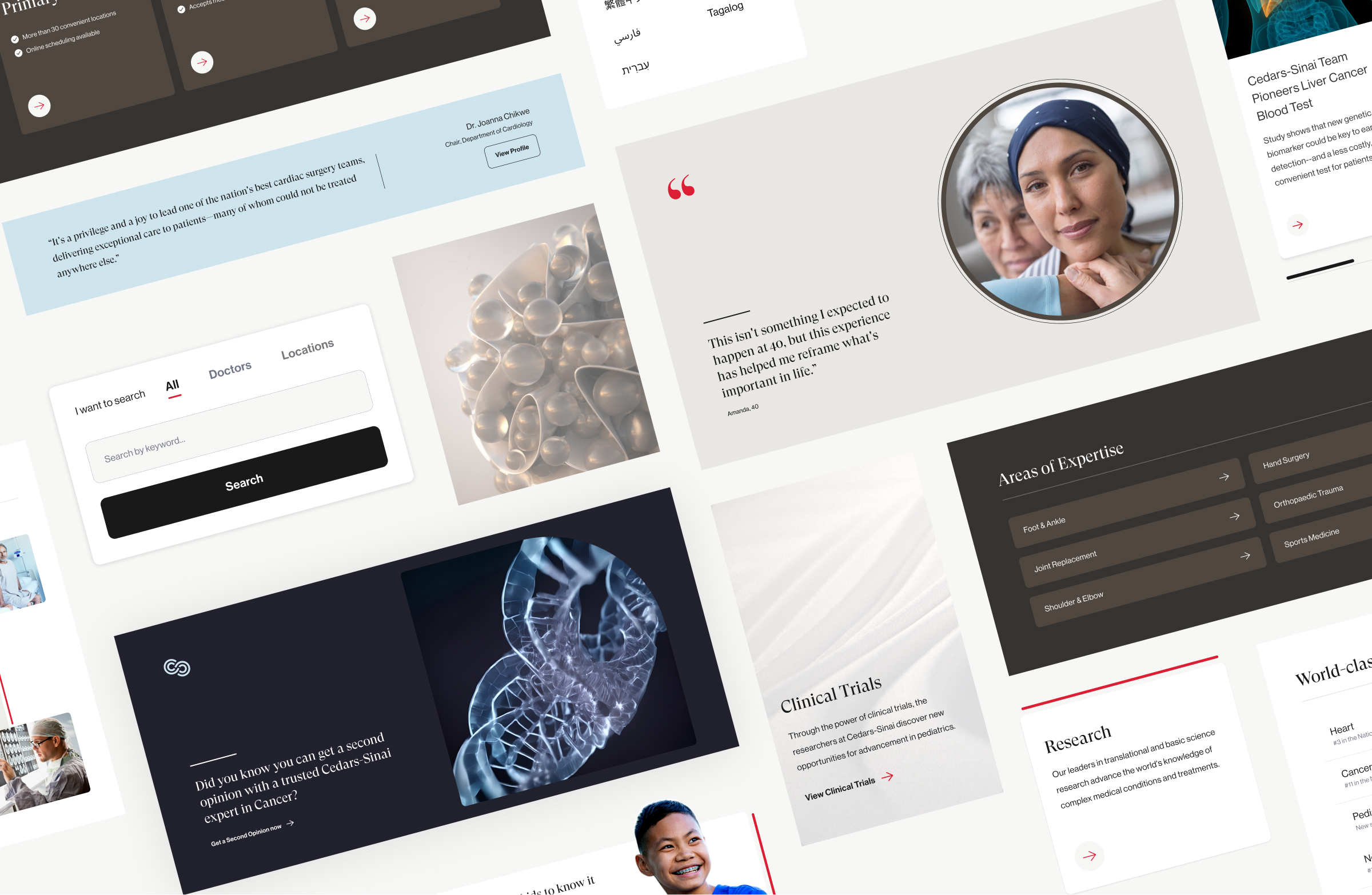
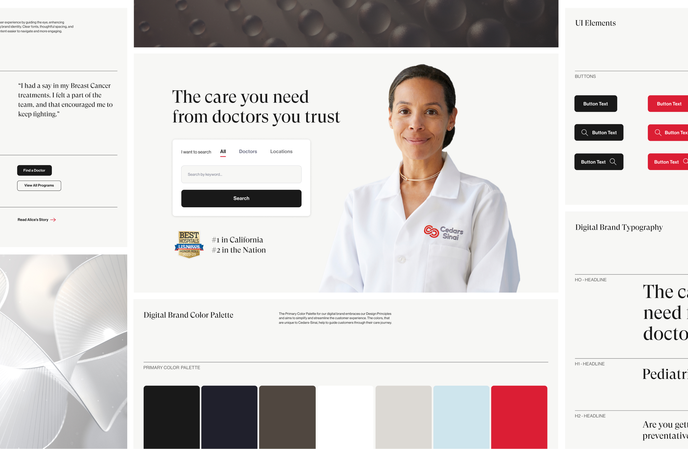
The new design system strikes a balance between sophistication and human connection. We completely revamped the system, introducing new typography, a refined color palette, and a more modern, expressive aesthetic. Built to scale, it’s a flexible system of components designed to evolve with the Cedars-Sinai brand, bringing clarity and cohesion across every touchpoint and serving as the backbone of the digital experience.
Vibrant brand red is used intentionally in small, purposeful moments, to guide users and prompt action. The experience is simplified by removing unnecessary copy and creating generous breathing room around each element. We refined the tone throughout, celebrating where appropriate and bringing calm during moments of stress. The result is an elevated, soothing, and streamlined experience with people at its core.
Our research makes us different. Cedars-Sinai conducts more clinical trials than any other institution, rapidly translating data into new treatments. This unique ability can best be demonstrated by thoughtful, multifaceted treatments that cultivate connections faster than ever before, speeding up and simplifying the evolution of care. Research directly affects those we serve. We don’t just do more trials than anyone, we get closer, down to the DNA. And more importantly, we share it all. Because access to treatment is as important as the treatment itself.
To bring this idea to life, we needed a visual metaphor that could express both the complexity of science and the humanity at its core. We asked: what if the way we see research could mirror the way we conduct it; focused, layered, and constantly revealing new insight?
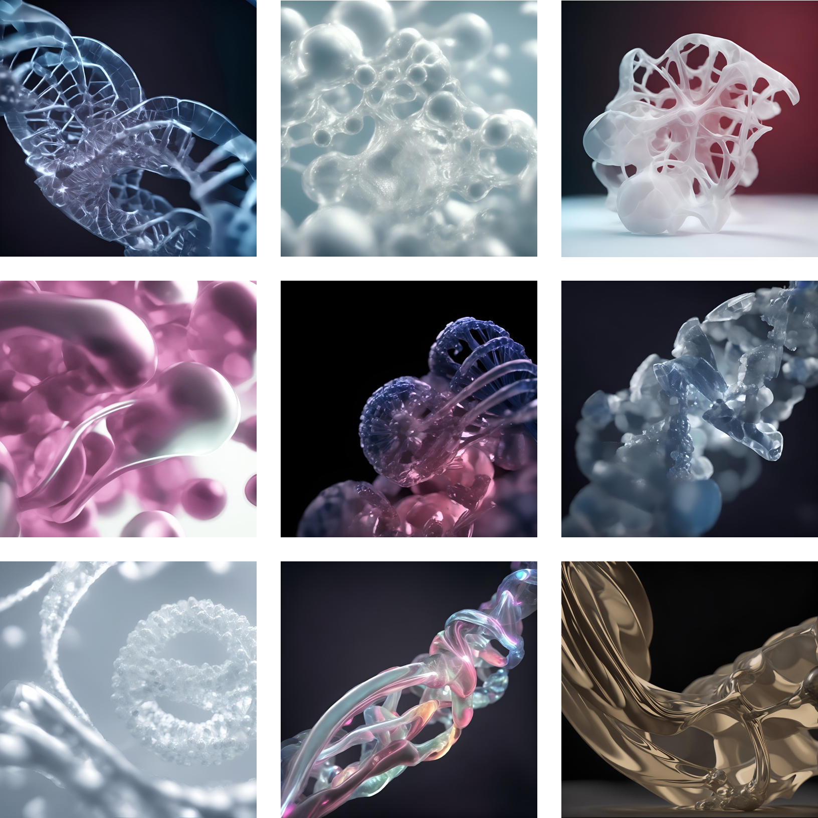
We explored the idea that the closer you look, the more you see, drawing inspiration from the film Powers of Ten by Charles and Ray Eames. Using AI and lighting effects, we created a layered visual language that transitions through magnified imagery, moving from microscopic intricacy to a broader human perspective. Each zoom reveals new detail, ultimately breaking through to a macro view that connects science back to the person behind it.
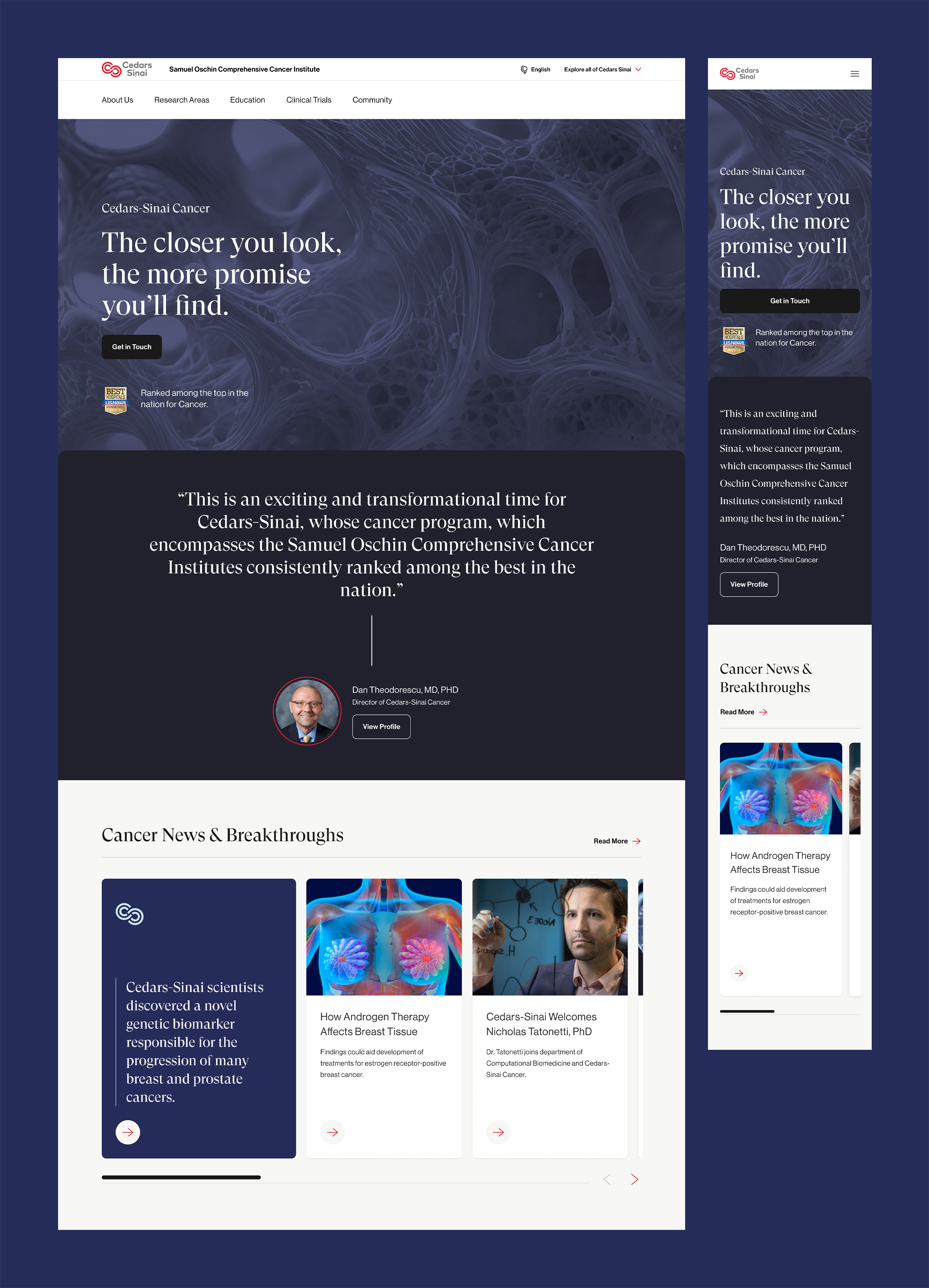
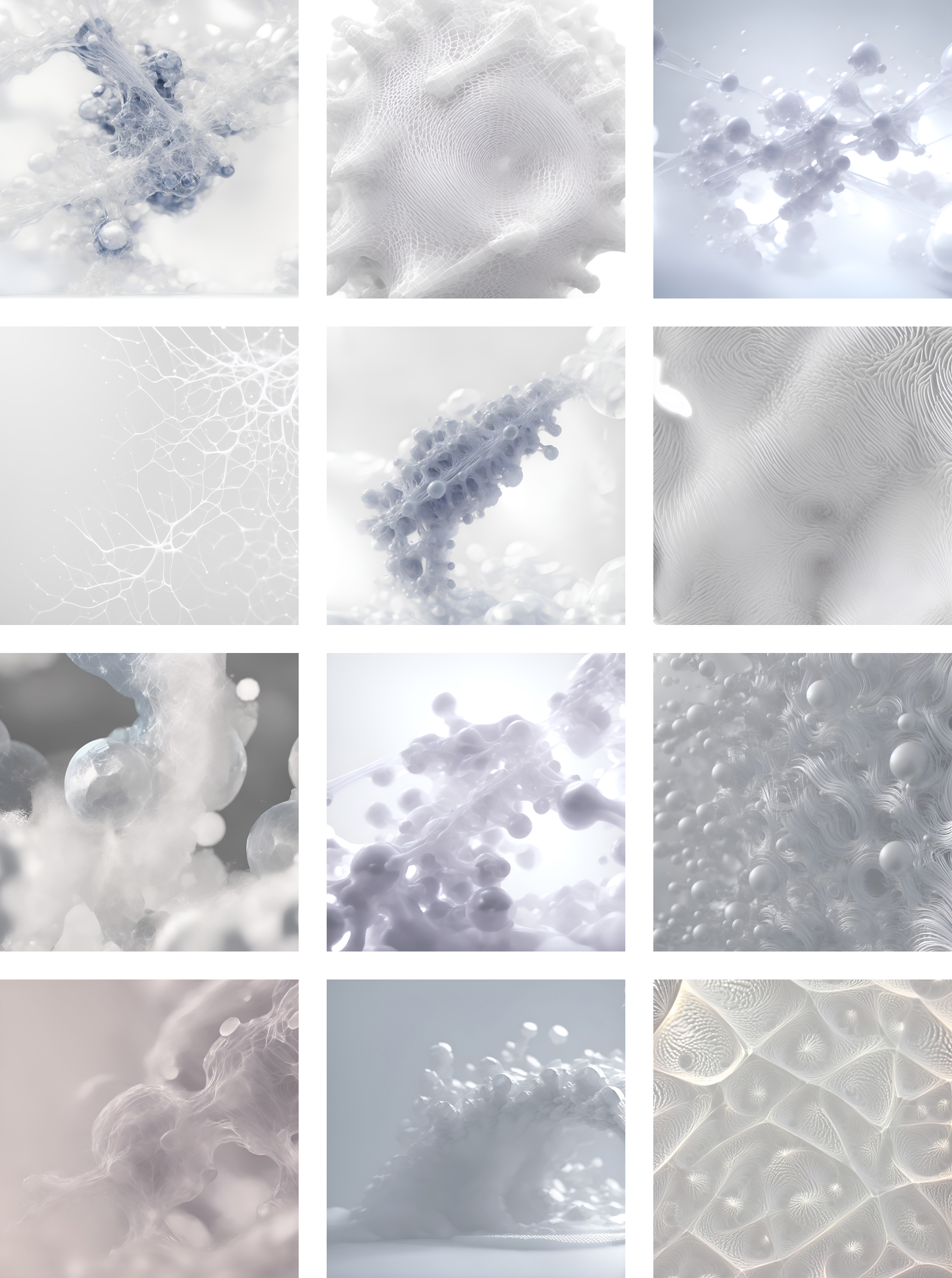
We visualized scientific precision through AI-generated imagery, blending organic forms with a clean, modern aesthetic. These visuals highlight the intricate beauty of the microscopic world, patterns, structures, and textures that echo the detail and discipline of research. Across both the Consumer and Research sides, we lead with science and quickly transition to people: the people behind the breakthroughs and the people whose lives are changed by them.
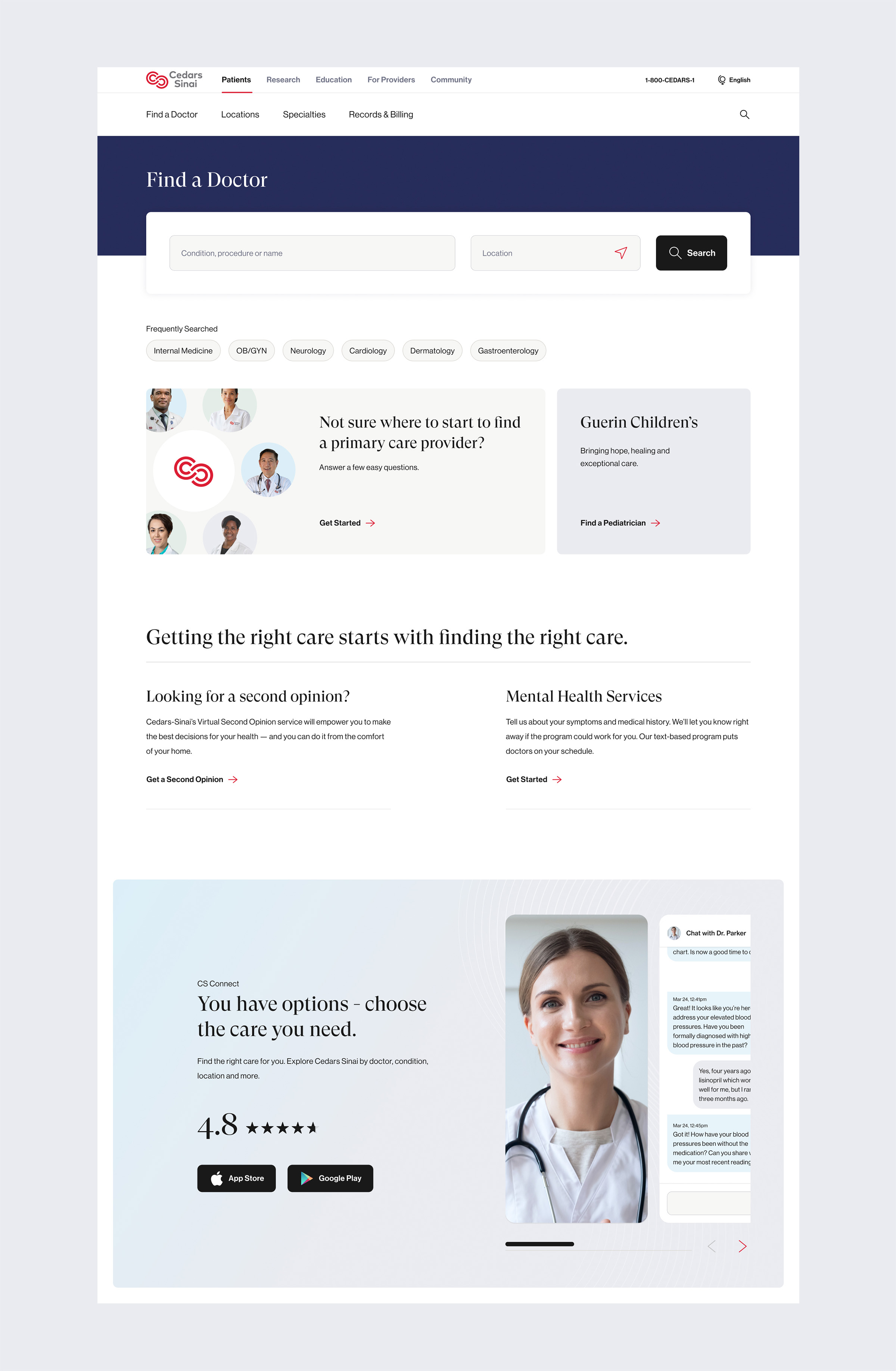
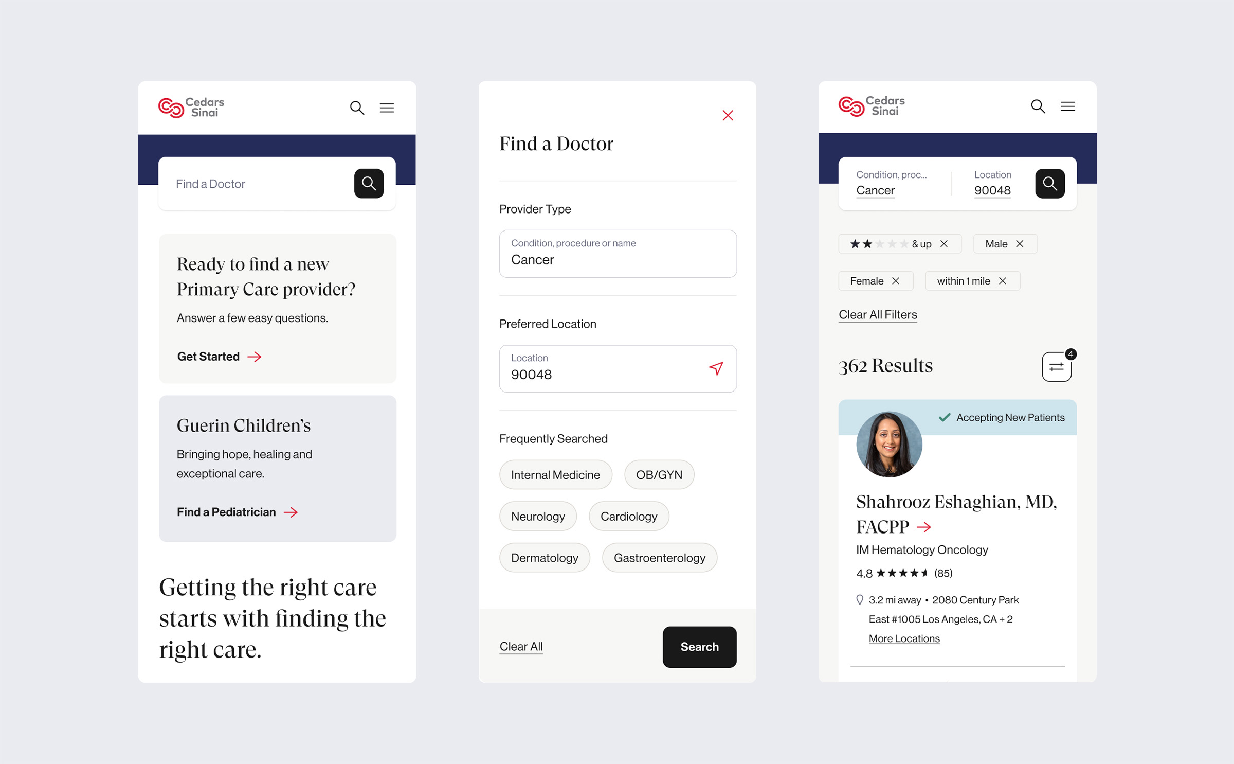
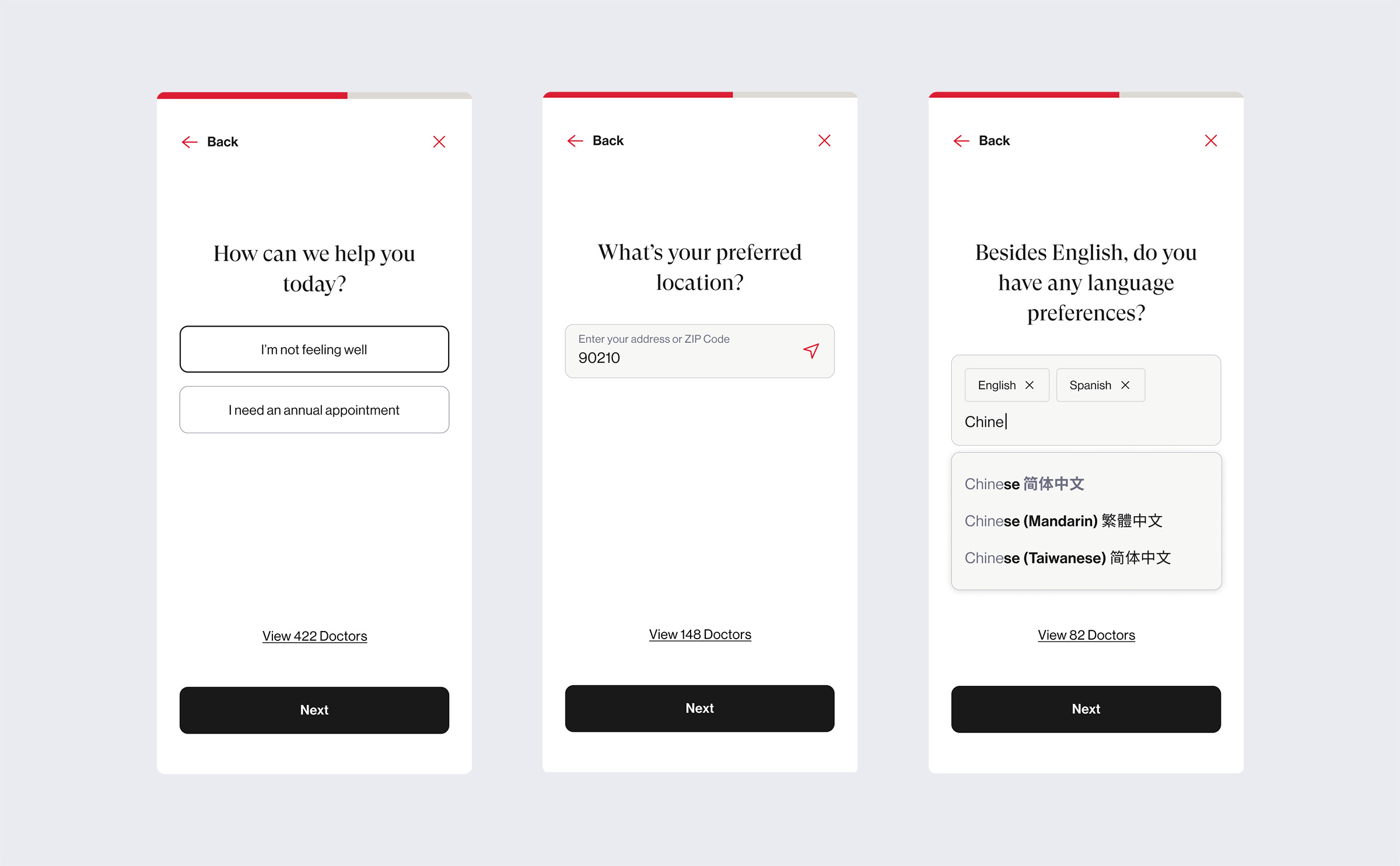
We redesigned the Find a Doctor experience to be clear, approachable, and centered on user needs. Built with the new design system, the interface uses simplified language, thoughtful spacing, and focused use of color to guide users through the experience. On mobile, we introduced a step-by-step concept that helps patients quickly narrow their options with minimal input. For those seeking more specific results, an advanced filter flow provides a deeper level of personalization, ensuring everyone can find care that fits.
40%
Increase in Find a Doctor page views
400%
Increase in visits to Primary Care
500%
Increase in visits to Urgent Care
Additional Credit:
Katie Templin VP, Experience & Content Strategy
Ross Maupin Group Creative Director
Alex Abel UX Strategy Lead
Jedi Wright UX Design Lead
Emily Wetrich UX Designer
Stephen Varga AI Generation Models
Adam Bueb Design Lead